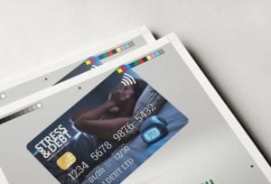
Logos – what happens
when you get it wrong?
[wpseo_breadcrumb]
Mark Coster
Founder of Pixooma

Logos are everywhere, we probably see several thousand a day. Many of them are memorable, eye-catching, clever, colourful and above all highly appropriate. But just occasionally there’s a Friday afternoon job. You know the sort I mean? It looks great initially, no one will be bothered to look too closely, everyone will love it attitude. And that’s where the fun really starts.
Sometimes these aberrations are just ugly, badly designed, old fashioned or confusing, whilst others are illogical, too subtle, rude or ill-advised. If you have a bad logo design, there’s a real chance that not only will people not be able to understand your message, but they could be offended too. If you don’t want to look unprofessional, we believe that the process of designing or redesigning logos should be well-planned and considered in order to avoid making any mistakes.
Below are some great visual examples of logos where more thought was most definitely needed.
If you don’t want to look unprofessional, we believe that the process of designing or redesigning logos should be well-planned and considered in order to avoid making any mistakes.
What’s in a name?
Not sure that many of us would have wanted to say they were Backrubbing or just about to Backrub it. Fortunately, in 1997, Backrub became Google (with a few subtle changes of the logo upto its current iteration) and the rest, as they say, is history. If you wondered where the word Google came from, then here’s the answer. Google was named after ‘Googolplex,’ or ‘Googol’ for short. The mathematical term (named by Milton Sirotta) means a number of nearly incomprehensible size. It represents the infinite amount of information that Google provides.

1995 - 1997

2015 - Present
Quick decision
Six days is how long The Gap’s rebrand lasted. The smaller box under the p was to make the logo more contemporary and current, honouring the "heritage through the blue box while still taking it forward”. However, consumers did not agree with this brand evolvement, so after less than a week the logo reverted back to what it had been originally. If this had been a carefully considered logo evolution, then they would surely have stuck to their guns and maintained the new logo. The fact they didn’t (and the speed at which they reversed the decision) suggests to me that it was a simple case here of a random, unannounced logo, for the sake of having a new logo.

1990

Oct 6 2010

Oct 12 2010
What is it?
The London 2012 Summer Olympics logo raised a few eyebrows and came in for plenty of healthy debate. Some people said it resembled both Lisa Simpson performing a sex act and a "punk" swastika. The Iranian government even claimed the stylized "2012" spelled out "Zion" and entertained boycotting the event in protest. Clearly no one saw these connotations before the logo was launched, so I wonder if it was kept so secret that there wasn’t enough canvassing of outside opinion – if more people had reviewed it, that may have tipped them off there were some potential problems?

Too much waffle?
When Uber redesigned their logo in 2016 they removed the ‘U’ and went for a different approach, and this was their justification…
“The new Uber logo is a representation of the company's mission to provide reliable transportation for everyone. The circle shape symbolizes unity and inclusivity, while the square inside it represents reliability and structure. The four quadrants within the square represent Uber’s four core values: trustworthiness, efficiency, respectfulness, and innovation. Together they form a strong foundation that will help ensure customers have an enjoyable experience with every ride they take with Uber. Additionally, the colours used in the logo are meant to evoke feelings of energy and movement - two things that are essential for any successful journey.”
Now don’t get me wrong. I firmly believe the creation of a professional logo involves more than just pretty shapes and colours. There can be meaning within it that represents the brand - sometimes in an obvious way, and sometimes less so. But frankly a lot of that explanation above is just meaningless waffle in my view, and used to justify the agencies fees. To me that symbol is a clever re-invention of the ‘U’ to actually be a destination point, and if that’s the case it all makes sense. Would you see that as a clearer explanation than the official one?

And finally – Be careful…
Ultimately a logo design needs to stand the test of time, and it won’t do that if it has been poorly developed, or has unfortunate connotations that you haven’t anticipated. Though in some cases you would have thought that the problems with it were obvious…
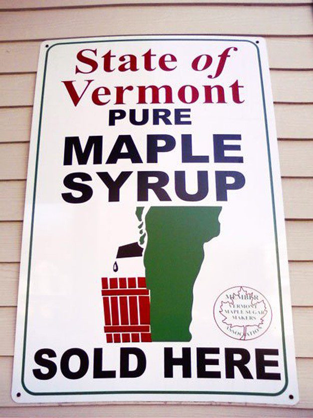
State of Vermont Maple Syrup
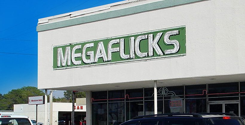
Mega Flicks Video Hire
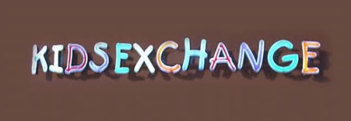
Kids Exchange
If you like this blog we can send future ones straight to your inbox…
Spread the word!


